*
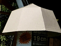
 The results of my earlier calculations in card model form were exactly as expected. I used a 3.9 height for both triangles and trapeziums. 3.9 for the trapezium base width and 2.77 for the triangle base width.
In plan view the choice of symmetrical dimensions produces a quite well-balanced, pleasing appearance.
 Unfortunately this view is never seen except from satellite.
As the eye level falls, the 'walls' quickly become far more prominent relative to the triangles on the "roof" or top.
Only a drone or chimney sweep enjoys this view.
 I was trying to think what it reminded me of. [Spl.Inf!] A medieval royal tent?
 When the eye falls close to or below the rim then the top triangles almost vanish from view. This is the normal view from the house and garden.
 I think I may have to look at alternative ratios to reduce the prominence of the more upright 'walls.' The last image [right] is very similar viewpoint to the barn. [Left] I think I must have automatically made the upper triangles taller to achieve an aesthetically, more balanced appearance.
 Since this is the normal view the appearance really ought to be considered. Upside is [perhaps] easier provision for an observation slit on two vertical panels.
What about three panels rather than two? One above the other for an even better approximation to a hemisphere. Smaller panels are easier to handle working alone. If I was going to horizontally brace the larger panels then the 'bends' could easily become those braces.
Placing the two dividing bars/bends 30 degrees vertically apart ensures equal height of all panels. Will this overcome the perspective problem when [normally] seen from below?
Click on any image for an enlargement.
*

No comments:
Post a Comment